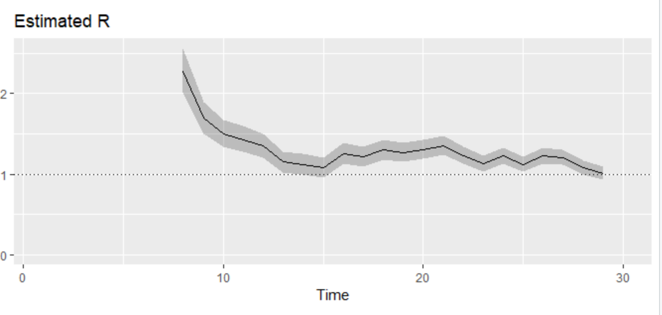
The graphs below have been tweeted by JohannesBorgen @jeuasommenulle
and as Johannes explains "there are based on ECDC data + a very recent model on R estimation + the EpiEstim R package + the estimates for serial interval distribution I found in the literature"
The data have been RTed by Prof Nicholas Christakis @NAChristakis with this comment : "Based on these calculations, Europe has brought its R,e down below 1.0, which means epidemic will end (at least while current physical distancing measures continue to be implemented)"
Before, going further, here is some info on R (reproduction) values
 |
| Austria |
 |
| Italy |
 |
| Greece |
Statistics are beautiful; they allow you to create trends, stories and at the end of the day political decisions.
However, given that these R values are based on number of cases (and therefore are dependent on how extensive testing is), isn’t normalisation of testing a prerequisite to have reliable values across countries? ie some countries test much less than others, isn’t that “analytical noise” affecting the reliability of R values ?
At the moment, the available data on total tests per million are here.
From the link, I have extracted the figure below which is also here.
 |
| within EU, there are huge differences at the levels of testing per million people |
